1  Base R Graphics

1.1 Customizing Plot Appearance

1.1.1 Adjusting Axis Labels and Titles

# Example 1
x <- 1:10
y <- x^2
plot(x, y, main = "Quadratic Function", xlab = "X", ylab = "Y")
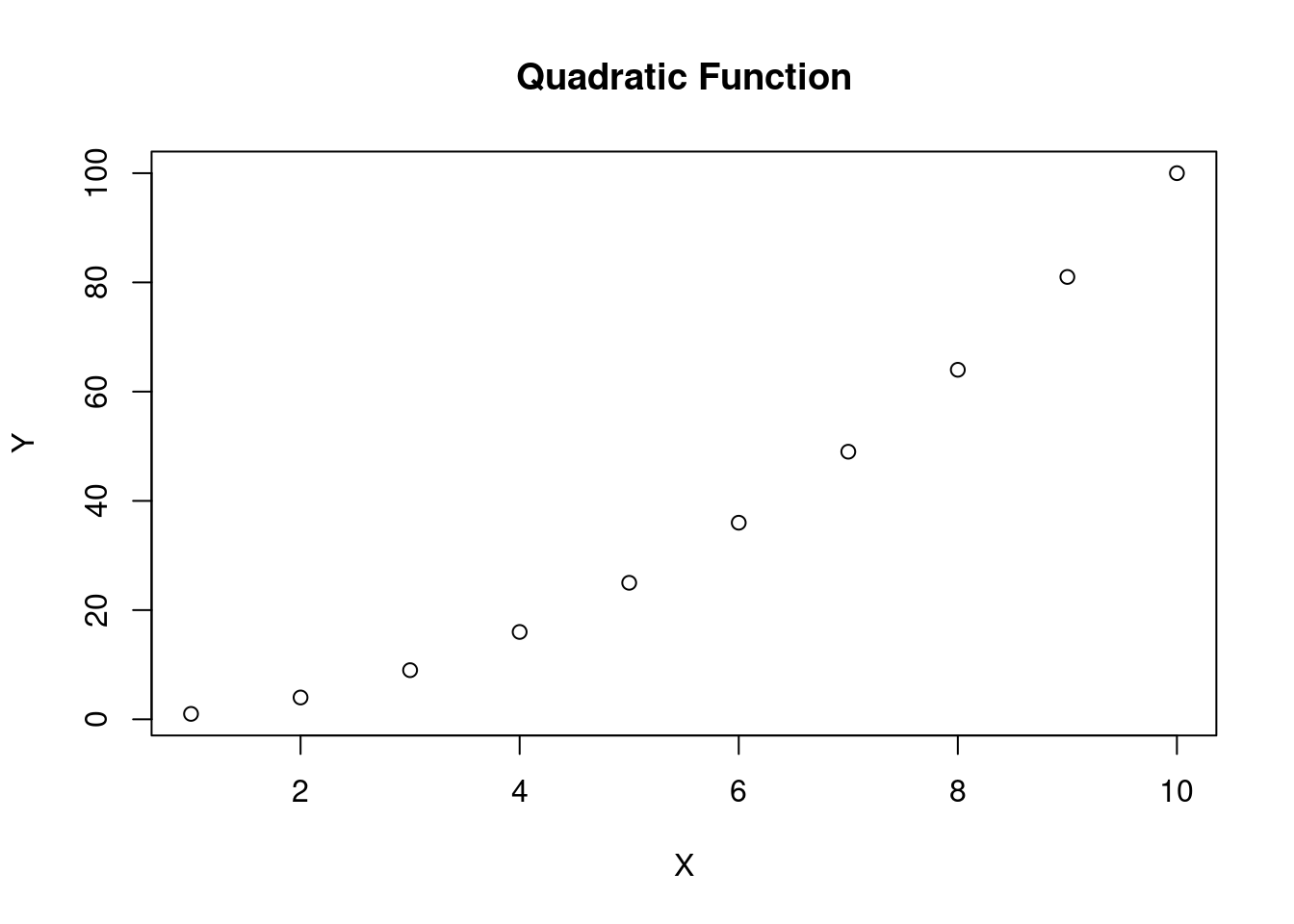
# Example 2
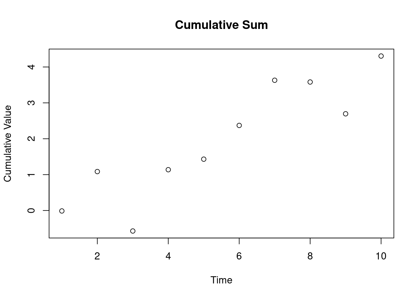
df <- data.frame(Time = 1:10, Value = cumsum(rnorm(10)))
plot(df$Time, df$Value, main = "Cumulative Sum", xlab = "Time", ylab = "Cumulative Value")

1.1.2 Changing Line Types, Colors, and Symbols

# Example 1
x <- 1:5
y1 <- x
y2 <- 2 * x
y3 <- 3 * x

plot(x, y1, type="b", col="red", pch=16, lty=1, ylim=c(0, 15), main="Multiple Lines Example")
points(x, y2, col="blue", pch=17, lty=2)
lines(x, y3, col="green", lty=3)

# Example 2
set.seed(123)
x <- rnorm(50)
y <- x + rnorm(50, mean=2)
plot(x, y, col="purple", pch=19, main="Scatter Plot with Customized Symbols", xlab="X", ylab="Y")

# Create data
x <- 1:10
y <- 1:10

# Line Types
par(mar=c(4, 4, 2, 2))
plot(x, y, type="n", main="All Line Types", xlab="X", ylab="Y", ylim=c(0, 6))
for (i in 0:5) {
  lines(x, rep(i*.5, length(x)), lty=i, col="black", lwd=2)
}

legend("topright", legend=0:5, title="Line Types", lty=0:5, col="black", lwd=2, ncol=3)

# Colors
par(mar=c(4, 4, 2, 2))
plot(x, y, type="n", main="All Colors", xlab="X", ylab="Y", ylim=c(0, 9))
for (i in 1:8) {
  lines(x, rep(i*.5, length(x)), col=i, lwd=2)
}

legend("topright", legend=1:8, title="Colors", col=1:8, lwd=2, ncol=2)

# symbols
# todo